Google data studio provides easy-to-use informative data with customisation dashboards. There is no charge for using Data Studio. Google data studio was introduced on 15 March 2016, providing a platform featuring charts and dashboards.
You can easily create reports and share the data. Data studio has many sources for pulling the data and has unlimited options in widgets. In which you can get free templates and tutorials for the learning process.
Using a Google account in the Manage access option, you can easily transfer ownership of the domain of your data studio to someone. The owner’s name is displayed in the owner column on the homepage.
Comparing Google Analytics to Google Studio shows that Google Studio is simpler. So Google Studio features an enhanced edition with an endless variety of widgets available on the dashboard Google analytics has limited functionality terms and only widgets in the dashboard.
PPC Dashboards

PPC dashboard is software and it allows the marketer and agencies to track the performance of the search .It is paid and add data that automatically generates the client report.
It is a digital marketing tool that uses marketing agencies and digital marketers for multiple resources and for tracking the performance of PPC.
The outcome was disclosed through a PPC campaign Report. So the report has some key metrics that help to run an effective PPC campaign. Demonstrate the short-term and long-term progress reports of the client.
Audience Objectives

To create a dashboard for your audience objectives are necessary. Your data should be neat and clean and correct and predefined the templates. Choose the right type of charts including bar chart, line chart, pie chart, Area charts, Table, and gauges. If you want key information for the easiest way for decision-makers then create an interactive dashboard. If you want to achieve the goal then create an interactive dashboard to tell the story.
When you narrate the story, it should be in your mind.
1: How do I make the decision in the end?
2: What to know about data or KPI?
3: How do you have a Framework?
They can get a good investment in online marketing. So it is an easy way to customize the Report and in the dashboard, the marketer explains the client’s performance.
By utilizing the Dashboard platform, you will reflect on digital marketing and be pleased to discover ways to impact your outcomes. In the PPC campaign that you are running, conversion rate metrics tell you. So PPC dashboard has automatic features and KPIs collect all data.
5 Things PPC Dashboard Must Have
Google data studio report gallery has several templates and you can choose the templates for starting your work and customize it perfectly. Google data studio in the dashboard has 5 things that are included here.
Title, Subheadings, and Context
For good visualization, you can add charts, dimensions, matrics in your google data studio. If your reader is not interested to see the charts in the data panel then you need to include the dashboard.
1: Give the title for data visualization, then give you subheadings, select the auto date range and use the multiple sources for data clarifying.
2: For title, description add a text box, then go to text properties, it has text font size and style.
This is a very easy step to include the text for context.
KPI Scorecards

KPI Scorecards describe the statistical records though they measure the progress of indicators’ performance. Through it, decision-makers get matrics and an overview of the performance of the scorecards.
Dashboard of the KPI is a tool that shows the feedback of business performance and shows how the business performance is against the key indicator KPI. It provides the solution, how to track the KPI and business metrics.
KIP measures the performance and the use of the scorecard displays the graphic indicators and shows the success and failure of the elements and efforts to achieve the goals.
In goal pacing, marketers fix the monthly or annual budgets. Sales or efficiency you need flexible budgets. Data studio has several options to add the objectives and pacing and add the written description to target the goal.
For states, the objective adds the header.
Bullet and Gauge are pacing charts used in it.
Add metrics /targets for calculation.
Trends and Historical Comparison
Historical trends is an application that shows the messages or trends for 24 hours, last week, last month, or last year. The historical trends are a special custom report that highlights the 5 snapshots, business dates, or business week. Historical trend reporting analyzes the daily basis for custom objects.
Snapshot Comparison
Snapshots in a single matrix table and scorecards provide a technique that demonstrates to your reader how competence to the interval is associated with one or more.
You select the comparison data range
Data range will be fix
The previous record of the Data range
One year earlier data range
Development
Line Chart

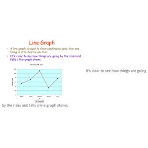
The line chart compare the earlier record that have remarkable impact and trends. Charts show the historical period of the performance and measurement of the breakdown.The trends of a line graph indicate the direction in which things are progressing.
Categorical Tables
When your audience want to multiple categories in matrix then the table is best for multiple categories .table has many categories including,
increase group, campaign, search, Keywords, concluding URL.
In the complexity of the PPC Dashboard, you can create a table
In the table, you can add
1: Chart or table
2: Dimension table
That describes the object and collects information and stores the attributes.
3: Matrics
4: Pannel
Conclusion
Google data studio offers explanatory data, that specially makes the dashboards. It provides the platform’s features, charts and dashboards.In Google data studio create the reports and then share the data. You can get free templates and tutorials from it .It has many widgets . 5 important things PPC Dashboard has are KPIs,Campaign performance ,spectator and Demographic , account and cost control ,goal tracking .

